--dxp Styling Hooks in LWR Sites
With --dxp styling hooks, you can set a single hook that affects both base and custom Lightning web components throughout your LWR site in Experience Cloud.
The Salesforce Lightning Design System (SLDS) provides many styling hooks that give granular control over how each base component looks. Styling hooks use CSS custom properties, which are variables within your CSS that cascade to all descendents within the scope of a selector. For example, the lightning-button component uses the styling hook --slds-c-button-color-background to change its background color. You can define the hook in any selector.
1<style>
2  /**
3   * Scoped to the root of the document and all its descendant elements.
4   */
5  :root {
6    --slds-c-button-color-background: peachpuff;
7  }
8
9  /**
10   * Scoped to any element with the class applied and all its descendant elements
11   */
12  .container {
13    --slds-c-button-color-background: peachpuff;
14  }
15</style>
But with this system, accurately reflecting your brand across every component in your site, including associated variations and states, often requires updating hundreds of styling hook definitions.
In contrast, --dxp styling hooks are a reduced set of custom properties that map to the lower-level component styling hooks, so you can set a single hook that changes many individual components at once. For example, setting the --dxp-g-brand hook affects the background color of the button, the link color, and the input border color on focus.
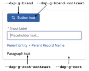
Root is the background color of the container, with root-contrast as the foreground color. Each color pairing must maintain an acceptable contrast ratio for accessibility.
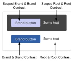
Any container can inherit styles (default) or define new styles. If a scoped container sets its own root (background color), remember to reevaluate all other --dxp hooks to make sure that they’re accessible against the new root.
We recommend using --dxp styling hooks to make general changes across the components in your site. But if the --dxp branding defaults don’t provide exactly what you need, you can use --slds-c and --slds-g-color styling hooks to fine-tune the appearance of individual components where necessary.
1<link rel=“stylesheet” href=“{ basePath }/assets/styles/salesforce-lightning-design-system.min.css?{ versionKey }” />
2<link rel=“stylesheet” href=“{ basePath }/assets/styles/dxp-site-spacing-styling-hooks.min.css?{ versionKey }” />
3<link rel=“stylesheet” href=“{ basePath }/assets/styles/dxp-styling-hooks.min.css?{ versionKey }” />
4<link rel=“stylesheet” href=“{ basePath }/assets/styles/dxp-slds-extensions.min.css?{ versionKey }” />
5
6<style>
7 .mycontainer {
8 /** Use --dxp-g to make broad changes **/
9 --dxp-g-root: #1a1b1e;
10 --dxp-g-root-contrast: #fff;
11 --dxp-g-brand: #5eb4ff;
12 --dxp-g-brand-contrast: #fff;
13 --dxp-g-neutral: #76716b;
14 --dxp-g-neutral-contrast: #fff;
15
16 /** Use --slds-c to fine-tune where necessary **/
17 --slds-c-button-color-background: peachpuff;
18 }
19</style>
-
Color --dxp Styling Hooks
In Experience Builder, the Colors tab is divided into families of colors that each have a specific use case along with a scale of possible values. With these properties, you can adjust the color values for the entire page or for any section within the page. When one of these color values is defined, other colors are subsequently derived and mapped to the individual base components.
-
Text --dxp Styling Hooks
Extensive text branding properties make it easy to control the styling of the headings, body, button, link, and forms text used throughout your site.
-
Site Spacing --dxp Styling Hooks
Site spacing allows you to customize the global spacing settings for your site. These styling hooks combine to provide a consistent spacing experience across each page.


 j
j