How --dxp Styling Hooks Map to Theme Panel Properties

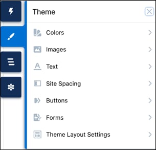
Each declarative property in the Theme panel maps to one or more programmatic --dxp styling hooks. When a user updates a property in the Theme panel, the system automatically updates any Lightning web component that uses the hooks associated with that branding property.

Theme panel in Experience Builder

Colors 

For button colors, see the Button Color section.

Basic

These Theme panel properties……map to these --dxp styling hooks
Background Color--dxp-g-root
--dxp-g-root-1
--dxp-g-root-2
--dxp-g-root-3
Text Color--dxp-g-root-contrast
--dxp-g-root-contrast-1
--dxp-g-root-contrast-2
--dxp-g-root-contrast-3
Brand Color--dxp-g-brand
--dxp-g-brand-1
--dxp-g-brand-2
--dxp-g-brand-3
Brand Foreground Color--dxp-g-brand-contrast
--dxp-g-brand-contrast-1
--dxp-g-brand-contrast-2
--dxp-g-brand-contrast-3

Text

These Theme panel properties……map to these --dxp styling hooks
Heading 1--dxp-s-text-heading-extra-large-color
Heading 2--dxp-s-text-heading-large-color
Heading 3--dxp-s-text-heading-medium-color
Heading 4--dxp-s-text-heading-small-color
Heading 5--dxp-s-text-heading-extra-small-color
Heading 6--dxp-s-text-heading-extra-extra-small-color
Paragraph 1--dxp-s-body-text-color
Paragraph 2--dxp-s-body-small-text-color

Links

These Theme panel properties……map to these --dxp styling hooks
Link Color--dxp-s-link-text-color
Link Hover Color--dxp-s-link-text-color-hover

Forms

These Theme panel properties……map to these --dxp styling hooks
Field Label--dxp-s-form-element-label-color
Placeholder Text--dxp-s-form-element-placeholder-text-color
Input Text--dxp-s-form-element-text-color
Input Text Focus--dxp-s-form-element-text-color-focus
Field Background Fill--dxp-s-form-element-color-background
Field Background Focus--dxp-s-form-element-color-background-active
Field Border--dxp-s-form-element-color-border
Field Border Focus--dxp-s-form-element-color-border-focus
Checkbox Background--dxp-s-form-checkbox-color-background
Selected Checkbox Background--dxp-s-form-checkbox-color-background-checked
Checkbox Border--dxp-s-form-checkbox-color-border
Selected Checkbox Border--dxp-s-form-checkbox-color-border-checked

Dropdowns

These Theme panel properties……map to these --dxp styling hooks
Dropdown Text Color--dxp-s-dropdown-text-color
Dropdown Background Color--dxp-s-dropdown-color-background
Dropdown Text Hover Color--dxp-s-dropdown-text-color-hover
Dropdown Background Hover Color--dxp-s-dropdown-color-background-hover
Dropdown Border Color--dxp-s-dropdown-color-border

See Color --dxp Styling Hooks for information about other available styling hooks that don’t appear in the Theme panel.

Tip

Images 

These Theme panel properties……map to these --dxp styling hooks
Site Logo--dxp-s-site-logo-path
--dxp-s-site-logo-url
Browser Icon (Favicon)No styling hook.
To add a favicon in Experience Builder, click Theme | Images and upload the file. After upload, the favicon is added automatically to your site’s browser tab.

See Create a Configurable Site Logo Component.

Text 

The Base Font Family and Base Font Size properties set the font family and font size on the <html> element of your site.

The Base Font Family defaults to Visitor’s Native System Font, and the Font Family for each text element defaults to Use Base Font Family. You can change these settings for any text element, but for the best site performance, minimize the number of font families used in the site.

The Base Font Size properties determine the default desktop and mobile font sizes for your site. When you change the base font size, you proportionally adjust any site elements, such as font sizes or spacing values, whose size is specified with relative units (rem or em).

The design system also provides different levels of text styling for your site. Each level includes several style properties that map to --dxp styling hooks using this format.

1--dxp-s-LEVEL-STYLE

Where LEVEL and STYLE are variables.

In the Headings and Body portion of this table, replace level with these values, as appropriate. For text in buttons, see the Buttons section. For text in forms, see the Forms section.

  • text-heading-extra-large for Heading 1
  • text-heading-large for Heading 2
  • text-heading-medium for Heading 3
  • text-heading-small for Heading 4
  • text-heading-extra-small for Heading 5
  • text-heading-extra-extra-small for Heading 6
  • body for Paragraph 1
  • body-small for Paragraph 2

For example, the --dxp styling hook for the Heading 1’s font family is

1--dxp-s-text-heading-extra-large-font-family

Base Font Family and Size

These Theme panel properties……map to these --dxp styling hooks
Base Font Family--dxp-s-html-font-family
Desktop Base Font Size--dxp-s-html-font-size
Mobile Base Font Size--dxp-s-html-font-size-mobile

Headings and Body

These Theme panel properties……map to these --dxp styling hooks
Font Family--dxp-s-LEVEL-font-family
Font Size--dxp-s-LEVEL-font-size
Font Style--dxp-s-LEVEL-font-style
Font Weight--dxp-s-LEVEL-font-weight
Text Decoration--dxp-s-LEVEL-text-decoration
Text Case--dxp-s-LEVEL-text-transform
Line Height--dxp-s-LEVEL-line-height
Character Spacing--dxp-s-LEVEL-letter-spacing

Note: Where LEVEL is a variable.

Link Text

These Theme panel properties……map to these --dxp styling hooks
Text Decoration--dxp-s-link-text-decoration
Focus Text Decoration--dxp-s-link-text-decoration-focus
Hover Text Decoration--dxp-s-link-text-decoration-hover

Site Spacing 

Desktop Site Spacing

These Theme panel properties……map to these --dxp styling hooks
Max Content Width--dxp-s-section-columns-max-width
--dxp-s-header-content-max-width
--dxp-s-footer-content-max-width
Section Padding: Top & Bottom--dxp-s-section-content-spacing-block-start
--dxp-s-section-content-spacing-block-end
Section Padding: Left & Right--dxp-s-section-content-spacing-inline-start
--dxp-s-section-content-spacing-inline-end
Column Gutters--dxp-s-column-spacer-size
Vertical Space Between Components--dxp-s-component-wrapper-spacer-size

Mobile Site Spacing

These Theme panel properties……map to these --dxp styling hooks
Max Content Width--dxp-s-section-columns-max-width-mobile
--dxp-s-header-content-max-width-mobile
--dxp-s-footer-content-max-width-mobile
Section Padding: Top & Bottom--dxp-s-section-content-spacing-block-start-mobile
--dxp-s-section-content-spacing-block-end-mobile
Section Padding: Left & Right--dxp-s-section-content-spacing-inline-start-mobile
--dxp-s-section-content-spacing-inline-end-mobile
Column Gutters--dxp-s-column-spacer-size-mobile
Vertical Space Between Components--dxp-s-component-wrapper-spacer-size-mobile

Buttons 

When you set the base font size for the text on your site (see the Text section), that setting affects the default font size of the text in the buttons on your site. For button colors, see the Button Colors section.

Text Values for All Buttons

These Theme panel properties……map to these --dxp styling hooks
Font Family--dxp-s-button-font-family
Font Style--dxp-s-button-font-style
Font Weight--dxp-s-button-font-weight
Text Case--dxp-s-button-text-transform
Text Decoration--dxp-s-button-text-decoration
Line Height--dxp-s-button-line-height
Character Spacing--dxp-s-button-letter-spacing

Standard Button Values

These Theme panel properties……map to these --dxp styling hooks
Vertical Padding--dxp-s-button-padding-block-start
--dxp-s-button-padding-block-end
Horizontal Padding--dxp-s-button-padding-inline-start
--dxp-s-button-padding-inline-end
Font Size--dxp-s-button-font-size
Border Radius--dxp-s-button-radius-border

Small Button Values

These Theme panel properties……map to these --dxp styling hooks
Vertical Padding--dxp-s-button-small-padding-block-start
--dxp-s-button-small-padding-block-end
Horizontal Padding--dxp-s-button-small-padding-inline-start
--dxp-s-button-small-padding-inline-end
Font Size--dxp-s-button-small-font-size
Border Radius--dxp-s-button-small-radius-border

Large Button Values

These Theme panel properties……map to these --dxp styling hooks
Vertical Padding--dxp-s-button-large-padding-block-start
--dxp-s-button-large-padding-block-end
Horizontal Padding--dxp-s-button-large-padding-inline-start
--dxp-s-button-large-padding-inline-end
Font Size--dxp-s-button-large-font-size
Border Radius--dxp-s-button-large-radius-border

Button Colors 

As of Winter ’25, color properties for buttons are on the Theme | Buttons panel.

Primary Buttons

Button StateThese Theme panel properties……map to these --dxp styling hooks
Default StateBackground--dxp-s-button-color
Default StateBorder--dxp-s-button-border-color
Default StateText--dxp-s-button-color-contrast
Hover StateHover Background--dxp-s-button-color-hover
Hover StateHover Border--dxp-s-button-border-color-hover
Hover StateHover Text--dxp-s-button-color-hover-contrast
Focus StateFocus Background--dxp-s-button-color-focus
Focus StateFocus Border--dxp-s-button-border-color-focus
Focus StateFocus Text--dxp-s-button-color-focus-contrast

Secondary Buttons

Button StateThese Theme panel properties……map to these --dxp styling hooks
Default StateBackground--dxp-s-secondary-button-color
Default StateBorder--dxp-s-secondary-button-border-color
Default StateText--dxp-s-secondary-button-text-color
Hover StateHover Background--dxp-s-secondary-button-color-hover
Hover StateHover Border--dxp-s-secondary-button-border-color-hover
Hover StateHover Text--dxp-s-secondary-button-text-color-hover
Focus StateFocus Background--dxp-s-secondary-button-color-focus
Focus StateFocus Border--dxp-s-secondary-button-border-color-focus
Focus StateFocus Text--dxp-s-secondary-button-text-color-focus

Tertiary Buttons

Button StateThese Theme panel properties……map to these --dxp styling hooks
Default StateBackground--dxp-s-tertiary-button-color
Default StateBorder--dxp-s-tertiary-button-border-color
Default StateText--dxp-s-tertiary-button-text-color
Hover StateHover Background--dxp-s-tertiary-button-color-hover
Hover StateHover Border--dxp-s-tertiary-button-border-color-hover
Hover StateHover Text--dxp-s-tertiary-button-text-color-hover
Focus StateFocus Background--dxp-s-tertiary-button-color-focus
Focus StateFocus Border--dxp-s-tertiary-button-border-color-focus
Focus StateFocus Text--dxp-s-tertiary-button-text-color-focus

Forms 

Similar to the different levels of text styling available for headings and body text on your site, the design system provides text styles for different parts of a form. In the Field Labels, Input Text, and Caption Text section of this table, replace level with these values, as appropriate.

  • label for Field Label
  • text for Input Text
  • caption-text for Caption

For example, the --dxp styling hook for the Field Label’s font family is

1--dxp-s-form-element-label-font-family

Spacing

These Theme panel properties……map to these --dxp styling hooks
Field Padding: Top--dxp-s-form-element-spacing-block-start
Field Padding: Right--dxp-s-form-element-spacing-horizontal-end
Field Padding: Bottom--dxp-s-form-element-spacing-block-end
Field Padding: Left--dxp-s-form-element-spacing-horizontal-start

Borders

These Theme panel properties……map to these --dxp styling hooks
Field Border Radius--dxp-s-form-element-radius-border
Field Border Weight--dxp-s-form-element-width-border
Checkbox Border Radius--dxp-s-form-checkbox-radius-border
Checkbox Border Weight--dxp-s-form-checkbox-width-border

Field Labels, Input Text, and Caption Text

These Theme panel properties……map to these --dxp styling hooks
Font Family--dxp-s-form-element-LEVEL-font-family
Font Size--dxp-s-form-element-LEVEL-font-size
Font Style--dxp-s-form-element-LEVEL-font-style
Font Weight--dxp-s-form-element-LEVEL-font-weight
Text Case--dxp-s-form-element-LEVEL-text-transform
Line Height--dxp-s-form-element-LEVEL-line-height
Character Spacing--dxp-s-form-element-LEVEL-letter-spacing

Note: Where LEVEL is a variable.

See Also