Color --dxp Styling Hooks
In Experience Builder, the Colors tab is divided into families of colors that each have a specific use case along with a scale of possible values. With these properties, you can adjust the color values for the entire page or for any section within the page. When one of these color values is defined, other colors are subsequently derived and mapped to the individual base components.
For example, if you change the brand color from the default blue, the system updates the associated brand colors in all base components.
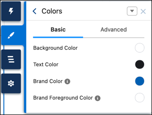
Experience Builder has a default derivation of these values that’s increasingly contrasted against the root.
- If the root background color is dark, derivation becomes increasingly lighter to contrast against the background.
- If the root background color is light, derivation becomes increasingly darker to contrast against the background.
These derivation colors are often used for interaction states. For example, the color of a button can change from --dxp-g-brand to --dxp-g-brand-1 on hover.
Additionally, many colors come in pairs, with a background color and an associated foreground color. Ensure that each color pairing maintains an acceptable contrast ratio for accessibility purposes.
- Use the correct family of hooks for your use case. For example, if the main color of your brand is red, don’t use
--dxp-g-destructivebecause it also happens to be red. Use--dxp-g-destructiveonly for error and invalid states. Instead, to define your brand color, use--dxp-g-brand. - You can’t configure
--dxp-g-neutral,--dxp-g-warning,--dxp-g-info,--dxp-g-success, or--dxp-g-destructivedeclaratively in the Theme panel. To modify these styling hooks, you must manually update them in the head markup. - Because alpha values affect transparency, modifying the value can have an unintended impact on page elements. If you’re overriding a color, we recommend keeping the alpha transparency at the same level as that color.
- Changes to ExperienceBundle or DigitalExperienceBundle don’t trigger automatic color derivations.
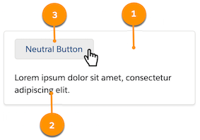
The background color of the page or a section within the page. Root-1 is often used for components that retain the root background color, but have an interaction state—for example, the background hover state of neutral buttons.
|  |
If you redefine --dxp-g-root on a section within a page, reevaluate all other --dxp styling hooks to make sure that they’re accessible against the new root. If they’re not, redefine the hooks.
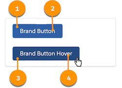
The primary brand color of your site. For Salesforce, the color is blue. Commonly used on buttons, links, focus states, and so on.
|  |
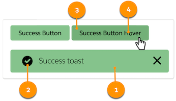
Communicates success. Commonly used on badges, alerts, toasts, and success variant buttons.
|  |
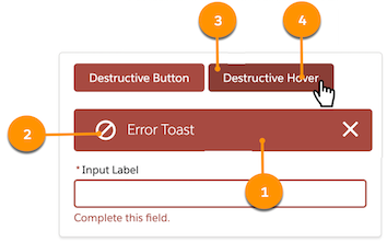
Communicates an error or an invalid state. Used on alerts, badges, toasts, form fields in an error state, and destructive variant buttons.
|  |
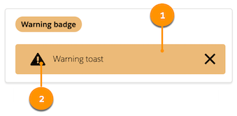
Communicates a warning to the user. Used on badges, alerts, and toasts.
|  |
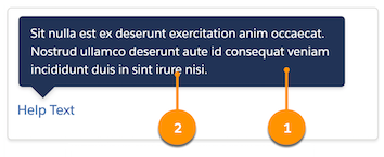
Communicates non-urgent information. Used on tooltips and popovers.
|  |
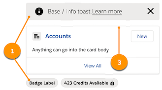
Used to break the flow between elements with borders and shadows. Neutral colors are also used for non-urgent informational elements, such as toasts and badges, and elements that don’t have interaction, such as icons and disabled inputs.
|  |
See Also