The following sections describe how to maintain portable components for server-side rendering (SSR).
Block Access to General Browser APIs
Rendering components on the server means you don’t have access to general browser APIs like window, document, and querySelector. If you’re performing these operations during any component lifecycle events that execute during SSR, you need to revise your code so that it becomes portable.
To prevent non-portable code from running during SSR, use the import.meta.env.SSR boolean. For example, this connectedCallback() doesn’t run window.addEventListener() if App gets SSRed.
1export default class App extends LightningElement{2 connectedCallback(){3 // guard usage of the window object so it does not throw during SSR4 if(!import.meta.env.SSR){5 window.addEventListener('error', (evt)=>{6 console.error(`⚠️ Uncaught error: ${evt.message}`);7});8}9}10}
Use globalThis for Feature Detection
Feature detection ensures that code only runs in supported browsers. Optional chaining causes failed expressions to return undefined instead of an error. This works best when the return value of the browser-only function isn’t needed by the component.
To enable feature detection via optional chaining, use the globalThis property.
Correct syntax with globalThis
1connectedCallback(){2// "globalThis" exists in all JavaScript environments3 globalThis.addEventListener?.('keydown', (e)=>{...});4}
You can’t use the window object because it’s undefined on the server.
Invalid syntax with window
1connectedCallback(){2 // the global "window" object is undefined on the server3 window.addEventListener('keydown', (e)=>{...});4}
Adjust Slotting Behavior for Built-In Events
Slotted content refers to anything contained in a <slot> element that you pass into a slot. This content renders as expected during SSR. However, native browser built-in events like slotchange can’t fire during SSR because they’re rendered outside of a browser context. As a result, you might observe changes to slotchange behavior in your components.
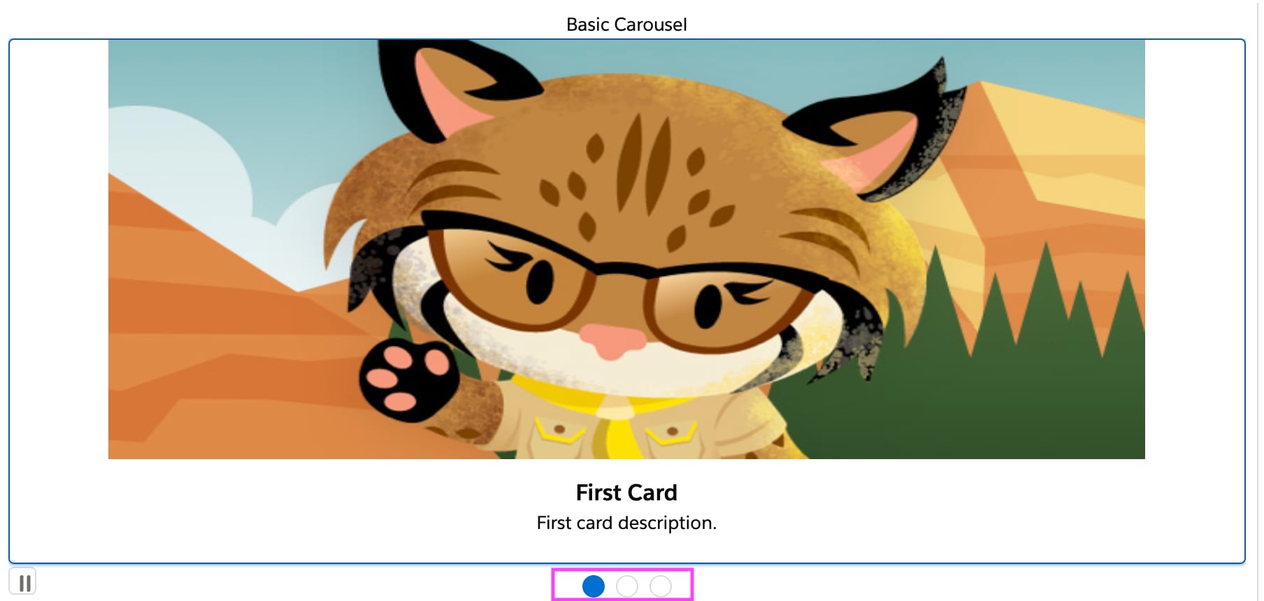
For example, a slotchange event determines the number of elements to display in this carousel component. The carousel is outlined in blue, and a pagination component is outlined in pink. The pagination component acts as a control for the number of images being displayed, and it shows a count of three in this example.
The pagination component logic runs during the slotchange event. Since the slotchange event doesn’t happen during an SSR flow, the first initial render only shows a count of 1.
When the component is rendered in the browser, the slotchange event fires and hydration updates the count to three.
When these browser-specific events occur, the webpage can sometimes display a small “flash” effect or layout shift. You can reduce the visibility of these effects by adding placeholders or loading messages to your code. This approach is useful when logic takes a long time to run on the client, like a REST or GraphQL data fetch.
Dynamically Import Non-Portable Modules
To ensure that non-portable modules don’t get processed on the server, import them dynamically in your components.
For example, this component imports a portable and a non-portable module.
To import these modules dynamically, the component can use an async/await function, like this. Remember to guard non-portable code using the import.meta.env.SSR boolean.
1import{portableApi}from 'my/library';2export default class Cmp extends LightningElement{3 async connectedCallback(){4 if(import.meta.env.SSR){5 portableApi(); // executed during SSR6}else{7 const{nonPortableApi} = await import('some/library');8 nonPortableApi(); // NOT reachable during SSR9}10}11}
Remove Host Element Mutations
Mutating the host element in connectedCallback() isn’t supported in SSR and CSR.
SSR hydration validates that the virtual DOM exactly matches the HTMLElement. For validation to succeed, each virtual DOM attribute has to have an equivalent HTMLElement counterpart. If a mutation occurs in a component’s connectedCallback(), changes that may appear in HTMLElement don’t appear in the virtual DOM.
For example, this connectedCallback() uses the classList anti-pattern to try to add class names to the host element. However, directly mutating the HTMLElement means the container class never appears in the virtual DOM.
You can pass a class from a parent component to a child component by wrapping the child in a <div> with a dynamic value for the class property. Then, implement the corresponding getter in the parent component’s JavaScript.
The parent component’s JavaScript uses the fromOutside property to set <c-parent from-outside="parent-class">. The getter ensures that the child component renders the my-child-needs-parent-class value on the class attribute.
parent.js
1import{api, LightningElement}from 'lwc';23export default class Cmp extends LightningElement{4 @api fromOutside;5 get classForChild(){6 return `my-child-needs-${this.fromOutside}`;7}8}
Use Supported Lightning Base Components
You can speed up app development by using the LWC versions of base components, which are out-of-the-box building blocks for user interfaces like Lightning Web Runtime (LWR) sites.
Only the following base components are supported for SSR. For more information about the Lightning base components, see the Component Library.
lightning-accordion
lightning-dynamic-icon
lightning-layout-item
lightning-spinner
lightning-accordion-section
lightning-file-upload
lightning-lookup-address
lightning-tab
lightning-alert
lightning-formatted-address
lightning-menu-divider
lightning-tabset
lightning-avatar
lightning-formatted-date-time
lightning-menu-item
lightning-textarea
lightning-badge
lightning-formatted-email
lightning-menu-subheader
lightning-tile
lightning-breadcrumb
lightning-formatted-location
lightning-modal
lightning-toast
lightning-breadcrumbs
lightning-formatted-name
lightning-modal-body
lightning-toast-container
lightning-button
lightning-formatted-number
lightning-modal-footer
lightning-tree
lightning-button-group
lightning-formatted-phone
lightning-modal-header
lightning-tree-item
lightning-button-icon
lightning-formatted-rich-text
lightning-pill
lightning-vertical-navigation
lightning-button-icon-stateful
lightning-formatted-text
lightning-pill-container
lightning-vertical-navigation-item
lightning-button-menu
lightning-formatted-time
lightning-progress-bar
lightning-vertical-navigation-item-badge
lightning-button-stateful
lightning-formatted-url
lightning-progress-indicator
lightning-vertical-navigation-item-icon
lightning-card
lightning-helptext
lightning-progress-ring
lightning-vertical-navigation-overflow
lightning-checkbox-group
lightning-icon
lightning-progress-step
lightning-vertical-navigation-section
lightning-click-to-dial
lightning-input
lightning-prompt
lightning-combobox
lightning-input-address
lightning-radio-group
lightning-confirm
lightning-input-location
lightning-rich-text-toolbar-button
lightning-datatable
lightning-input-rich-text
lightning-rich-text-toolbar-button-group
lightning-dual-listbox
lightning-layout
lightning-select
SSR can impact your existing style rules for base components on your site. To learn how to adapt your styles for SSR, see Update Lightning Base Components Styling.
Next Steps
Now that your components can opt-into SSR, we recommend testing them with the SSR playground and test runner to catch and correct unexpected behavior. To learn more, follow the instructions in Test Your Components.
Developer Preview Feature
Feature is available as a developer preview. Feature is not generally available unless or until Salesforce announces its general availability in documentation or in press releases or public statements. All commands, parameters, and other features are subject to change or deprecation at any time, with or without notice. Do not implement functionality developed with these commands or tools.


 j
j