


 j
jIntroduction
Customize Text Message Bubbles
Create a Custom Pre-Chat Form
Send a Message as the End User
Custom Lightning Type APIs for Enhanced Chat v2
Messaging Header Events
Event Listeners
Enhanced Chat API Developer Guide
You can customize the messaging conversation window header using a custom conversation header Lightning Web Component (LWC).
These steps show you how to create a messaging conversation window header using a custom LWC. The sample code creates a header, as shown in the screenshot. The code includes:
We left these features out of this example to keep the sample code short, but you can add them later to your LWC with your own custom code.
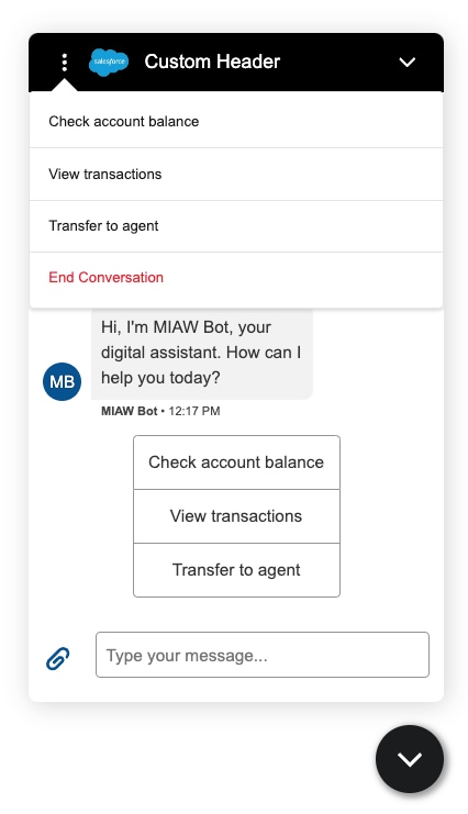
Create an LWC bundle. See Salesforce Trailhead: Build Lightning Web Components.
Let’s call our example bundle customHeader.
In the customHeader.js-meta.xml configuration file of your LWC, specify the lightningSnapin__MessagingHeader target.
You add this target to the configuration file so you can see the LWC in your Enhanced Web Chat experience. In other words, adding this target makes the LWC available for selection in Custom UI Components in Embedded Service Deployments in Setup. See Customize your UI with Lightning Web Components.
1<?xml version="1.0" encoding="UTF-8"?>
2<LightningComponentBundle xmlns="http://soap.sforce.com/2006/04/metadata">
3 <apiVersion>60.0</apiVersion>
4 <isExposed>true</isExposed>
5 <targets>
6     <target>lightningSnapin__MessagingHeader</target>
7 </targets>
8</LightningComponentBundle>
In the customHeader.js file, use these methods to customize the header.
To connect your custom component to Embedded Service, import the dispatchMessagingEvent, assignMessagingEventHandler, and MESSAGING_EVENT methods from the public event store lightningsnapin/eventStore.
1import { dispatchMessagingEvent, assignMessagingEventHandler, MESSAGING_EVENT } from "lightningsnapin/eventStore";To dispatch a Messaging event, use dispatchMessagingEvent. See Messaging Conversation Window Header Events dfor all available Messaging header events.
1/**
2* Dispatch all public event handlers with data for a given event.
3* @param {String} eventName - Name of event to dispatch. Can't be null.
4* @param {Object} eventData - Data to pass to each event handler.
5*                             Can't be null. Use empty object {} if you're passing no data.
6*/
7dispatchMessagingEvent(eventName, eventData);
To listen to a Messaging event, use assignMessagingEventHandler.
1/**
2* Assign a public event handler for an event.
3* @param {String} eventName - Name of the event to assign a handler.
4* @param {Function} eventHandler - Function to assign to the event.
5*/
6assignMessagingEventHandler(eventName, eventHandler);1import { LightningElement, api } from "lwc";
2import { dispatchMessagingEvent, assignMessagingEventHandler, MESSAGING_EVENT } from "lightningsnapin/eventStore";
3
4const SLDS_MENU_SELECTOR = "slds-dropdown-trigger slds-dropdown-trigger_click";
5
6export default class ChatHeader extends LightningElement {
7 /**
8 * Deployment configuration data.
9 * @type {Object}
10 */
11 @api configuration = {};
12
13 /**
14 * The status of the conversation. Valid values:
15 * - NOT_STARTED
16 * - OPEN
17 * - CLOSED
18 * @type {ConversationStatus}
19 */
20 @api conversationStatus;
21
22 /**
23 * Class name for header menu.
24 * @type {String}
25 */
26 menuClass = SLDS_MENU_SELECTOR;
27
28 /**
29 * Array to store bot options menu.
30 * @type {Array}
31 */
32 chatbotOptionsMenu = [];
33
34 /**
35 * Whether the use is authenticated.
36 * AuthMode can have the following values:
37 * - Auth: user is in verified, which corresponds to the authenticated user mode.
38 * - UnAuth: user is in unverified, which corresponds to the guest user mode.
39 */
40 get isAuthenticatedContext() {
41 return this.configuration.embeddedServiceMessagingChannel.authMode === "Auth";
42 }
43
44 /**
45 * Whether to show the back button.
46 * @type {Boolean}
47 */
48 showBackButton = false;
49
50 /**
51 * Whether to show the header menu button.
52 * @returns {Boolean}
53 */
54 get showMenuButton() {
55 return this.conversationStatus === "OPEN";
56 }
57
58 /**
59 * Whether to show the header menu.
60 * @type {Boolean}
61 */
62 _showMenu = false;
63 get showMenu() {
64 return this._showMenu;
65 }
66 set showMenu(shouldShow) {
67 this.menuClass = SLDS_MENU_SELECTOR + (shouldShow ? " slds-is-open" : "");
68 this._showMenu = shouldShow;
69 }
70
71 /**
72 * Whether to show the close button.
73 * @returns {Boolean}
74 */
75 get showCloseButton() {
76 return this.conversationStatus !== "OPEN";
77 }
78
79 /**
80 * Handle back button click.
81 */
82 onBackButtonClick() {
83 dispatchMessagingEvent(MESSAGING_EVENT.BACK_BUTTON_CLICK, {});
84 }
85
86 /**
87 * Handle menu button click.
88 */
89 onMenuButtonClick() {
90 this.showMenu = !this.showMenu;
91 }
92
93 /**
94 * Handle minimize button click.
95 */
96 onMinimizeButtonClick() {
97 dispatchMessagingEvent(MESSAGING_EVENT.MINIMIZE_BUTTON_CLICK, {});
98 }
99
100 /**
101 * Handle close button click.
102 */
103 onCloseButtonClick() {
104 dispatchMessagingEvent(MESSAGING_EVENT.CLOSE_CONTAINER, {});
105 }
106
107 /**
108 * Handle end conversation button click.
109 */
110 onMenuOptionClick(event) {
111 event.preventDefault();
112
113 dispatchMessagingEvent(MESSAGING_EVENT.MENU_ITEM_SELECTED, {
114 selectedOption: this.chatbotOptionsMenu.find(option => option.optionIdentifier === event.target.getAttribute("value"))
115 });
116
117 this.showMenu = false;
118 }
119
120/**
121* Handle end chat button click.
122*
123* Ending a messaging session is only supported for verified users.
124* Ending a conversation is only supported for unverified users.
125*/
126onEndChatClick() {
127 if (this.isAuthenticatedContext) {
128 this.configuration.util.endSession();
129 } else {
130 dispatchMessagingEvent(MESSAGING_EVENT.CLOSE_CONVERSATION, {});
131 }
132
133 this.showMenu = false;
134}
135
136 connectedCallback() {
137 assignMessagingEventHandler(MESSAGING_EVENT.PARTICIPANT_JOINED, (data) => {
138 console.log(`Participant joined`);
139
140 if (data.options && Array.isArray(data.options)) {
141 data.options.forEach((participantOption) => {
142 this.chatbotOptionsMenu.push(participantOption);
143 });
144 }
145 });
146
147 assignMessagingEventHandler(MESSAGING_EVENT.PARTICIPANT_LEFT, (data) => {
148 console.log(`Participant left`);
149
150 this.chatbotOptionsMenu = [];
151 });
152
153 assignMessagingEventHandler(MESSAGING_EVENT.UPDATE_HEADER_TEXT, (data) => {
154 console.log(`Update header text: ${data.text}`);
155 });
156
157 assignMessagingEventHandler(MESSAGING_EVENT.TOGGLE_BACK_BUTTON, (data) => {
158 console.log(`Toggle back button visibility.`);
159
160 this.showBackButton = data.showBackButton;
161 });
162 }
163}In the customHeader.html file, add all the header components and buttons to render in the UI.
1<template>
2    <!-- Back button -->
3    <template if:true={showBackButton}>
4        <button class="headerButton backButton" onclick={onBackButtonClick}>
5            <lightning-icon icon-name="utility:back" variant="inverse" size="x-small"></lightning-icon>
6        </button>
7    </template>
8
9    <!-- Header menu -->
10    <section class={menuClass}>
11        <template if:true={showMenuButton}>
12            <!-- Menu button -->
13            <button class="headerButton menuButton" onclick={onMenuButtonClick}>
14                <lightning-icon icon-name="utility:threedots_vertical" variant="inverse" size="x-small"></lightning-icon>
15            </button>
16        </template>
17
18        <!-- Menu options-->
19        <section class="optionsMenu slds-dropdown slds-dropdown_left slds-nubbin_top-left">
20            <ul class="slds-dropdown__list">
21                <!-- Bot menu options -->
22                <template for:each={chatbotOptionsMenu} for:item="option">
23                    <li class="slds-dropdown__item" key={option.optionIdentifier}>
24                        <button class="chatbotMenuOption"
25                                value={option.optionIdentifier}
26                                onclick={onMenuOptionClick}>
27                            <span value={option.optionIdentifier}>{option.title}</span>
28                        </button>
29                    </li>
30                </template>
31
32            <!-- End chat option -->
33            <li class="slds-dropdown__item">
34                <button class="chatbotMenuOption"
35                        onclick={onEndChatClick}>
36                    <span class="slds-text-color_error">End Chat</span>
37                </button>
38            </li>
39            </ul>
40        </section>
41    </section>
42
43    <!-- Header logo -->
44    <!-- Replace this with your logo file. -->
45    <img src="/path/to/logo.png" alt="My Logo"/>
46
47    <!-- Header text -->
48    <h2>Custom Header</h2>
49
50    <!-- Minimize button -->
51    <button class="headerButton minimizeButton" onclick={onMinimizeButtonClick}>
52        <lightning-icon icon-name="utility:chevrondown" variant="inverse" size="x-small"></lightning-icon>
53    </button>
54
55    <!-- Close button -->
56    <template if:true={showCloseButton}>
57        <button class="headerButton closeButton" onclick={onCloseButtonClick}>
58            <lightning-icon icon-name="utility:close" variant="inverse" size="x-small"></lightning-icon>
59        </button>
60    </template>
61</template>
In the customHeader.css file, customize the UI style of the header components and buttons.
1:host {
2    width: 100%;
3    max-width: 100%;
4    min-height: 50px;
5    display: flex;
6    align-items: center;
7    box-sizing: border-box;
8    position: relative;
9    padding: 0 14px;
10    height: 50px;
11    max-height: 50px;
12    background-color: black;
13}
14
15img {
16    margin-right: 4px;
17    max-height: 40px;
18    max-width: 40px;
19}
20
21h2 {
22    margin: 0;
23    text-align: initial;
24    align-self: center;
25    flex-grow: 1;
26    overflow: hidden;
27    text-overflow: ellipsis;
28    white-space: nowrap;
29    font-weight: lighter;
30    font-size: inherit;
31    color: white;
32}
33
34.headerButton {
35    background: none;
36    border: none;
37    display: inline-flex;
38    height: 32px;
39    min-height: 32px;
40    width: 32px;
41    min-width: 32px;
42    align-items: center;
43    justify-content: center;
44}
45
46.headerButton:hover:before {
47    content: " ";
48    position: absolute;
49    top: 9px;
50    width: 32px;
51    height: 32px;
52    background-color: #fff;
53    opacity: .2;
54    border-radius: 4px;
55    box-sizing: border-box;
56    pointer-events: none;
57}
58
59.headerButton.menuButton:hover:before {
60    top: 0;
61}
62
63.headerButton.closeButton:hover:before {
64    right: 14px;
65}
66
67lightning-icon {
68    fill: white;
69}
70
71.optionsMenu {
72    width: 100vw;
73    left: -0.9rem;
74}
75
76.optionsMenu > .slds-dropdown__list {
77    max-height: 20rem;
78    overflow-y: auto;
79}
80
81.slds-nubbin_top-left:before,
82.slds-nubbin_top-left:after {
83    left: 2rem;
84    top: -0.5rem;
85}
86
87.slds-dropdown {
88    max-width: 30rem;
89}
90
91.slds-dropdown__item > button {
92    position: relative;
93    z-index: 100;
94    padding: 0.75rem 1rem;
95    background-color: #ffffff;
96    border: 0;
97    display: flex;
98    width: 100%;
99}
100
101.slds-dropdown__item > button:focus,
102.slds-dropdown__item > button:hover {
103    outline: 0;
104    text-decoration: none;
105    background-color: #e5e5e5;
106}
107
108.slds-dropdown__list > .slds-dropdown__item:not(:first-child) {
109    border-top: #e2e2e2 1px solid;
110}
111
112.slds-dropdown__item .slds-truncate:not(.closeConversation) {
113    color: #005290;
114}
Deploy the LWC to your org. See Salesforce Developer Guide: Introducing Lightning Web Components.
Add the LWC to your Embedded Service Deployment. See Salesforce Help: Customize Your UI with Lightning Web Components. To get custom LWC configuration details, see Salesforce Developer Guide: Get Custom Lightning Web Components Configuration Details
j