


 j
jVisualforce Charting Limitations and Considerations
Building a Complex Chart with Visualforce Charting
Chart Colors
Chart Layout and Annotation
Bar Charts
Other Linear Series Charts
Pie Charts
Gauge Charts
Radar Charts
Previous Versions
By default, chart colors match those of the built-in reporting and analytics charts so that you can create visually-consistent dashboards. If you want to create your own color scheme you can customize the colors of most chart elements.
To provide a set of color definitions to draw data series elements (bars, pie wedges, and so on), use the colorSet attribute. Set <apex:chart colorSet="..."> to specify the colors to be used for every data series in a chart. Set colorSet on a data series component to specify colors for that series only.
A colorSet is a string that is a comma-delimited list of HTML-style hexadecimal color definitions. For example, colorSet="#0A224E,#BF381A,#A0D8F1,#E9AF32,#E07628". Colors are used in sequence. When the end of the list is reached, the sequence starts over at the beginning.
Here’s a pie chart that uses a custom color scheme for the pie wedge colors:
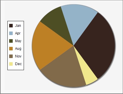
1<apex:pageBlockSection title="Simple colorSet Demo">
2    <apex:chart data="{!pieData}" height="300" width="400" background="#F5F5F5">
3        <apex:legend position="left"/>
4        <apex:pieSeries labelField="name" dataField="data1"
5            colorSet="#37241E,#94B3C8,#4D4E24,#BD8025,#816A4A,#F0E68C"/>
6    </apex:chart>
7</apex:pageBlockSection>
Use the background attribute to set a background color for the entire chart.
You can use a colorSet with all data series components except <apex:radarSeries>. Additional colorSet details and further options for configuring colors of other chart elements are described for specific data series components.
j