Make a Component Width-Aware
When you add a component to a region on a page in the Lightning App Builder, use @api flexipageRegionWidth to pass the region’s width to the component. Then with some strategic CSS, you can tell the component to render in different ways in different regions at run time.
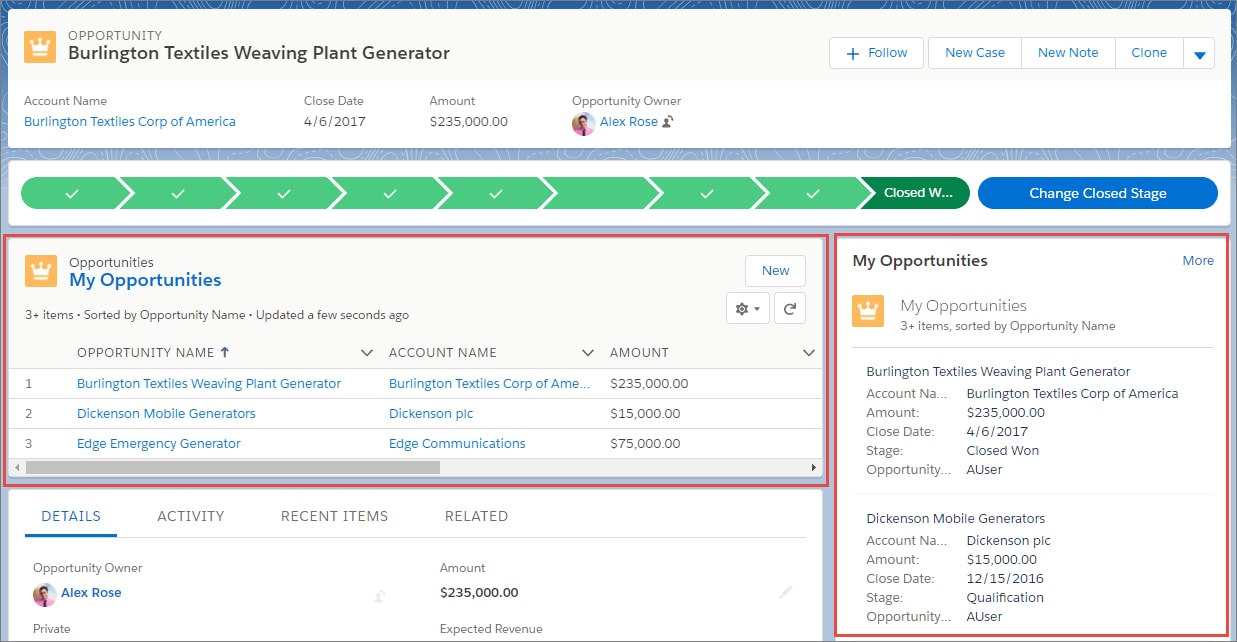
For example, the List View component renders differently in a large region than in a small region because it’s a width-aware component.
In the component’s JavaScript class, use the @api decorator to create a public flexipageRegionWidth property. This property receives the width value of the region that the component resides in on the page.
1// testClass.js
2import { LightningElement, api } from "lwc";
3
4export default class TestClass extends LightningElement {
5  @api flexipageRegionWidth;
6}
Use the flexipageRegionWidth property in the HTML template. When the value of flexipageRegionWidth changes, the component rerenders.
1
2<template>
3 <div class={flexipageRegionWidth}>...</div>
4</template>
Use CSS to define the component’s behavior when it renders in different region widths. Valid CSS class values are SMALL, MEDIUM, and LARGE. This sample CSS snippet tells the component to render with a red background when it’s in a large region. It renders with a blue background when it’s in a small region.
1/* testClass.css */
2
3div.LARGE {
4  background: red;
5  ...;
6}
7div.SMALL {
8  background: blue;
9  ...;
10}
This release is in preview. Features described here don't become generally available until the latest general availability date that Salesforce announces for this release. Before then, and where features are noted as beta, pilot, or developer preview, we can't guarantee general availability within any particular time frame or at all. Make your purchase decisions only on the basis of generally available products and features.


 j
j