Standard Definitions for Layouts

Specify the layout of a complex property type by using standard layout definitions. A layout is made up of one or more layout definitions.

These are the standard layout definitions.

  • lightning/verticalLayout
  • lightning/tabSetLayout
  • lightning/accordionLayout

Each layout definition can contain a lightning/propertyLayout definition to specify where in the property sheet the property editor is expected to appear. The layout definition takes a required attribute called “property,” whose value is a reference to a sub-property in the schema. The property editor that’s rendered is based on the lightning:type that the sub-property references and whether the sub-property is overridden by the componentOverrides.

lightning/verticalLayout 

To arrange your property sheet in a flat list, use the lightning/verticalLayout definition. In this case, the properties appear in the order in which you define them in the schema. This layout can take only lightning/propertyLayout definitions as children.

Here’s a code snippet of a layout with properties for borderStyle, borderWeight, borderRadius, layoutHeight, and layoutWidth arranged in vertical order.

1{
2  "editor": {
3    "layout": {
4      "definition": "lightning/verticalLayout",
5      "children": [
6        {
7          "definition": "lightning/propertyLayout",
8          "attributes": {
9            "property": "borderStyle"
10          }
11        },
12        {
13          "definition": "lightning/propertyLayout",
14          "attributes": {
15            "property": "borderWeight"
16          }
17        },
18        {
19          "definition": "lightning/propertyLayout",
20          "attributes": {
21            "property": "borderRadius"
22          }
23        },
24        {
25          "definition": "lightning/propertyLayout",
26          "attributes": {
27            "property": "layoutHeight"
28          }
29        },
30        {
31          "definition": "lightning/propertyLayout",
32          "attributes": {
33            "property": "layoutWidth"
34          }
35        }
36      ]
37    }
38  }
39}

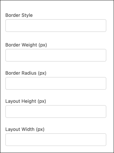
Here’s how the layout looks in the component property panel in Experience Builder.

Vertical layout in component property panel

lightning/accordionLayout 

To arrange your property sheet in accordion sections, use the lightning/accordionLayout definition. This layout definition can take only lightning/accordionSectionLayout definitions as children. The lightning/accordionSectionLayout definition, in turn, can use only lightning/propertyLayout definitions as children.

Here’s an example of the properties for borderStyle, borderWeight, borderRadius, layoutHeight, and layoutWidth laid out in accordion sections for Borders and Size.

1{
2  "editor": {
3    "layout": {
4      "definition": "lightning/accordionLayout",
5      "children": [
6        {
7          "definition": "lightning/accordionSectionLayout",
8          "attributes": {
9            "label": "Borders"
10          },
11          "children": [
12            {
13              "definition": "lightning/propertyLayout",
14              "attributes": {
15                "property": "borderStyle"
16              }
17            },
18            {
19              "definition": "lightning/propertyLayout",
20              "attributes": {
21                "property": "borderWeight"
22              }
23            },
24            {
25              "definition": "lightning/propertyLayout",
26              "attributes": {
27                "property": "borderRadius"
28              }
29            }
30          ]
31        },
32        {
33          "definition": "lightning/accordionSectionLayout",
34          "attributes": {
35            "label": "Size"
36          },
37          "children": [
38            {
39              "definition": "lightning/propertyLayout",
40              "attributes": {
41                "property": "layoutHeight"
42              }
43            },
44            {
45              "definition": "lightning/propertyLayout",
46              "attributes": {
47                "property": "layoutWidth"
48              }
49            }
50          ]
51        }
52      ]
53    }
54  }
55}

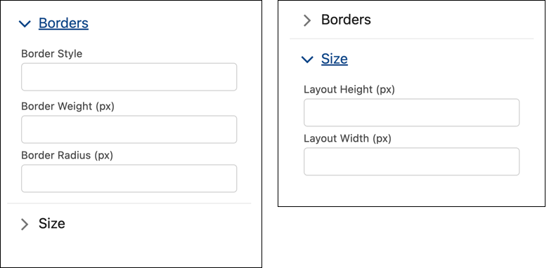
Here’s how the accordion layout looks in the component property panel in Experience Builder.

Accordion layout for Borders and Size in component property panel

lightning/tabSetLayout 

To arrange your property sheet in tabs, use the lightning/tabSetLayout definition. This layout definition can take only lightning/tabLayout definitions as children. The lightning/tabLayout definition, in turn, can take only lightning/propertyLayout definitions as children.

Here’s an example of the properties borderStyle, borderWeight, borderRadius, layoutHeight, and layoutWidth laid out on tabs for Borders and Size.

1{
2  "editor": {
3    "layout": {
4      "definition": "lightning/tabSetLayout",
5      "children": [
6        {
7          "definition": "lightning/tabLayout",
8          "attributes": {
9            "label": "Borders"
10          },
11          "children": [
12            {
13              "definition": "lightning/propertyLayout",
14              "attributes": {
15                "property": "borderStyle"
16              }
17            },
18            {
19              "definition": "lightning/propertyLayout",
20              "attributes": {
21                "property": "borderWeight"
22              }
23            },
24            {
25              "definition": "lightning/propertyLayout",
26              "attributes": {
27                "property": "borderRadius"
28              }
29            }
30          ]
31        },
32        {
33          "definition": "lightning/tabLayout",
34          "attributes": {
35            "label": "Size"
36          },
37          "children": [
38            {
39              "definition": "lightning/propertyLayout",
40              "attributes": {
41                "property": "layoutHeight"
42              }
43            },
44            {
45              "definition": "lightning/propertyLayout",
46              "attributes": {
47                "property": "layoutWidth"
48              }
49            }
50          ]
51        }
52      ]
53    }
54  }
55}

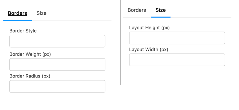
Here’s how the tabset layout looks in the component property panel in Experience Builder.

Tabset layout for Borders and Size in component property panel

See Also