Open a modal window in response to a user action, such as clicking a button or link. The modal blocks interaction with everything else on the page until the user acts upon or dismisses the modal.
The lightning/modal module provides the LightningModal component to create a modal window that overlays the current window.
Unlike most base components, when you use this component you don’t add a <lightning-modal> tag to your component template or extend LightningElement. There is no lightning-modal component. Instead, you create a modal by extending LightningModal.
The LightningModal component provides helper components for specifying the modal content. Use the required lightning-modal-body component to provide the main content displayed in the modal. Use the optional lightning-modal-header component to add a title to the top of the modal, and the optional lightning-modal-footer component to add a footer to the bottom.
Create a Modal
To create a modal component, import LightningModal from lightning/modal. Don’t import from LightningElement.The component has access to the normal LWC resources as well as the special container, helper components, methods, and events of the lightning/modal module.
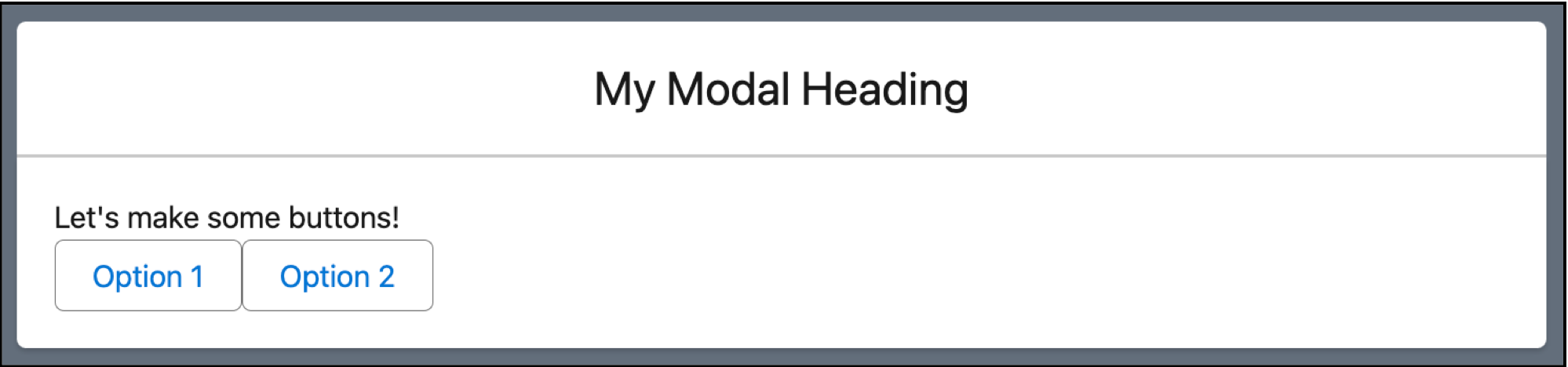
Let’s create a simple modal called myModal that looks like this.
Here’s the JavaScript for myModal. It imports only api, not LightningElement, from lwc. Instead, it imports LightningModal and extends LightningModal to its own class. It defines an options array to accept content that’s provided when the modal is opened by another component. The handleOptionClick function handles button clicks in the modal. When the user clicks the Option 1 or Option 2 button, this.close(id) returns the option that they chose and the modal closes.
1/* c/myModal.js */23import{api}from "lwc";4import LightningModal from "lightning/modal";56export default class MyModal extends LightningModal{7 // Data is passed to apis via .open({ options: [] })8 @api options = [];910 handleOptionClick(e){11 const{target} = e;12 const{id} = target.dataset;13 // this.close() triggers closing the modal14 // the value of `id` is passed as the result15 this.close(id);16}17}
Here’s the myModal.html template, which includes a header and the modal body.
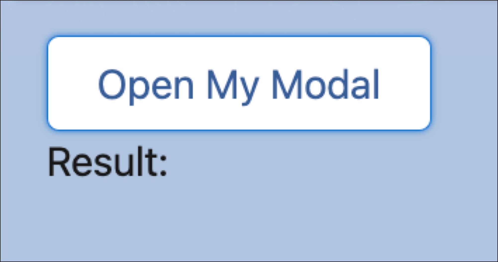
Here’s a component myApp that opens the myModal component when you click the Open My Modal button. It displays the result returned when the modal’s Option 1 or Option 2 buttons are clicked.
The component myApp.js imports MyModal from the myModal component. The button handler opens the myModal component using the component’s open method and provides data to be used in the modal’s options property.


 j
j