Edit Template Example for Custom Data Types

This example shows a custom data type with templates containing components rather than simple markup.

The lwc-recipes repo has several components that demonstrate inline editing with Apex and the lightning/uiRecordApi module. Look for components whose names start with datatableInline.

Note

This example creates a datatable with a custom datatype for the Amount.

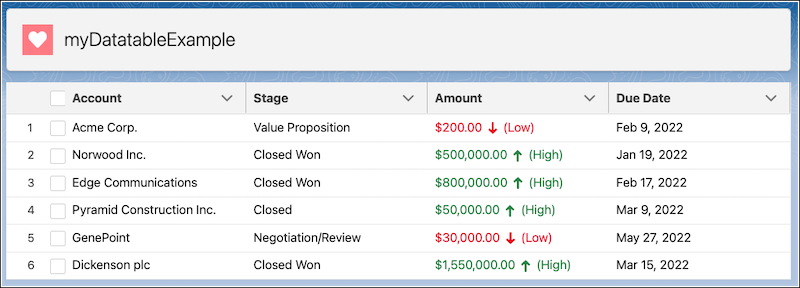
Here’s the datatable on initial load.

Datatable with custom type that's editable

The myDatatableWrapper component contains the extended datatable component that defines the custom type.

1/* myDatatableWrapper.html */
2
3<template>
4  <c-my-custom-type-datatable columns={COLS} key-field="id" data={data}>
5  </c-my-custom-type-datatable>
6</template>
1// myDatatableWrapper.js
2
3import { LightningElement } from 'lwc';
4export default class MyDatatableWrapper extends LightningElement {
5    COLS = [
6        { label: 'Account', type: 'text', fieldName: 'account', editable: false, displayReadOnlyIcon: true},
7        { label: 'Stage', type: 'text', fieldName: 'stage', editable: false, displayReadOnlyIcon: true},
8        { label: 'Amount', type: 'customNumber', fieldName: 'amount', editable: true,
9            typeAttributes: {
10                status: {fieldName: 'status'},
11                step: {fieldName: 'step'}
12            }
13        },
14        { label: 'Due Date', type: 'date', fieldName: 'date', editable: false, displayReadOnlyIcon: true}
15    ];
16
17    data = [
18        {account: 'Acme Corp.', amount: '200.00', status: 'action:user',
19            step: '0.01', stage:'Value Proposition', date: '2022-02-10T00:00:00Z'},
20        {account: 'Norwood Inc.', amount: '500000.00', status: 'action:user',
21            step: '0.01', stage:'Closed Won', date: '2022-01-20T00:00:00Z'},
22        {account: 'Edge Communications', amount: '800000.00', status: 'action:user',
23            step: '0.01', stage:'Closed Won', date: '2022-02-18T00:00:00Z'},
24        {account: 'Pyramid Construction Inc.', amount: '50000.00', status: 'action:user',
25            step: '0.01', stage:'Closed ', date: '2022-03-10T00:00:00Z'},
26        {account: 'GenePoint', amount: '30000', status: 'action:user',
27            step: '0.01', stage:'Negotiation/Review	', date: '2022-05-28T00:00:00Z'},
28        {account: 'Dickenson plc', amount: '1550000.00', status: 'action:user',
29            step: '0.01', stage:'Closed Won', date: '2022-03-16T00:00:00Z'}
30    ]

Here’s the folder for the extended datatable with an editable custom type.

1myCustomTypeDatatable
2   ├──customNumber.html
3   ├──customNumberEdit.html
4   ├──myCustomTypeDatatable.js
5   └──myCustomTypeDatatable.js-meta.xml

Define the custom type and import the display and edit templates in the extended datatable.

1// myCustomTypeDatatable.js
2import LightningDatatable from "lightning/datatable";
3import customNumberTemplate from "./customNumber.html";
4import customNumberEditTemplate from "./customNumberEdit.html";
5
6export default class MyCustomTypeDatatable extends LightningDatatable {
7  static customTypes = {
8    customNumber: {
9      template: customNumberTemplate, // display mode
10      editTemplate: customNumberEditTemplate, // edit mode
11      standardCellLayout: true,
12      typeAttributes: ["status", "step"],
13    },
14  };
15}
  • You import HTML templates into the extended datatable’s JavaScript file as shown above.
  • Child components used inside a custom cell (for example, c-my-fancy-number in customNumber.html) are referenced directly in the template. Don’t import them in the datatable’s JavaScript file.

Note

The display template uses a child component to render the value.

1/*customNumber.html*/
2<template>
3  <c-my-fancy-number value={value}> </c-my-fancy-number>
4</template>

The child component defines the data type’s display and includes logic to determine the styling that’s applied to the data.

The myFancyNumber component evaluates the data to apply classes, icons, and icon styling.

1/* myFancyNumber.html */
2
3<template>
4  <div class={computedClass}>
5    <lightning-formatted-number format-style="currency" value={value}>
6    </lightning-formatted-number>
7    <lightning-icon
8      class="slds-p-horizontal_xx-small"
9      icon-name={computedIcon}
10      size="xx-small"
11      variant={iconVariant}
12    >
13    </lightning-icon>
14    ({range})
15  </div>
16</template>
1// myFancyNumber.js
2
3import { LightningElement, api, track, wire } from "lwc";
4
5export default class MyFancyNumber extends LightningElement {
6  @api value;
7  get range() {
8    return this.value > 50000 ? "High" : "Low";
9  }
10  get computedClass() {
11    return this.value > 50000 ? "slds-text-color_success" : "slds-text-color_error";
12  }
13
14  get computedIcon() {
15    return this.value > 50000 ? "utility:arrowup" : "utility:arrowdown";
16  }
17
18  get iconVariant() {
19    return this.value > 50000 ? "success" : "error";
20  }
21}

The customNumberEdit.html template uses the lightning-input component with type="number".

1/* customNumberEdit.html */
2<template>
3  <lightning-input
4    type="number"
5    value={editedValue}
6    label={columnLabel}
7    required={required}
8    step={typeAttributes.step}
9    data-inputable="true"
10  >
11  </lightning-input>
12</template>

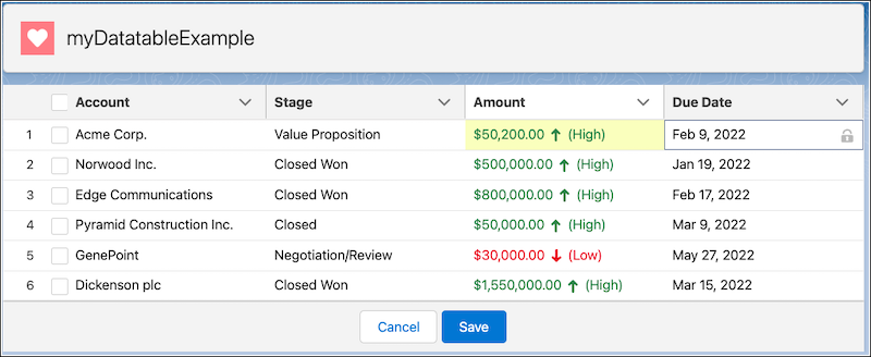
Here’s the datatable after a custom number type field has been edited before the table is saved. The edited field is highlighted in yellow.

Datatable with an edited custom type field

How a Custom Component Affects Editing 

  • Inline edit flow: Unchanged. Set editable: true on the column. Edited values appear in editedValue, and the table emits onsave with draft-values.
  • Keyboard and a11y: Unchanged when standardCellLayout: true and the input in the edit template has data-inputable="true".
  • Other behaviors: Sorting, selection, pagination, and save handling work the same as with standard types.

For information about saving changed data, see Display Data in a Table with Inline Editing.