Use widgets in any Customer Service Center customizable area. Commonly used widgets include attribute_layout, attribute_form, attribute_listing, text, link, and tabs.
Widgets are always named directly and configured by registering them with a type.
Name Type Description configobject an object that contains widget-specific configurations typestring the required widget type
Example of widget registration:
1 "widgets" : { 2 "description" : { 3 "type" : "attribute_listing" , 4 "config" : { 5 "attributes" : [ 6 "system_attribute" , 7 "c_customAttribute" 8 ] , 9 "columns" : 2 10 } 11 } , 12 "my_layout" : { 13 "type" : "attribute_layout" 14 } , 15 "option-selector" : { 16 "type" : "product_option" 17 } , 18 "quantity-selector" : { 19 "type" : "product_quantity" 20 } 21 } Details on customizing each widget are included in the remaining sections of this guide.
Attribute_form Widget
The attribute_form widget provides a form element for attributes depending on metadata. The metadata are either derived from attributes or through metadata overwrite in layout.
The attribute_form widget is only configured through layout and its subelements.
1 { 2 "layout" : [ 3 { 4 "condition" : "data" , 5 "layout" : [ 6 { 7 "id" : "address" , 8 "layout" : [ 9 { 10 "attribute" : "first_name" , 11 "meta" : { 12 "maxLength" : 50 13 } , 14 "width" : 6 15 } , 16 { 17 "attribute" : "last_name" , 18 "meta" : { 19 "maxLength" : 50 , 20 "required" : true 21 } , 22 "width" : 6 23 } 24 } 25 ] 26 } 27 ] , 28 "widgets" : { 29 "address" : { 30 "type" : "attribute_form" 31 } 32 } 33 } With the customization, it’s also possible to override the metadata of attributes to:
Provide or restrict options of values, for example, the state codes for certain countries
Change the type, format or constraints of attributes, for example, the format of the credit card expiration month or the maximum input length
Mark an attribute as required
This table lists the options of overriding meta data.
label
Metadata can be adjusted to show different localized text as coming from the Salesforce B2C Commerce platform metadata
required
If an attribute is required in a form, it can be marked accordingly for mark in the UI and verify it.
1 { 2 "attribute" : "payment_card.holder" , 3 "meta" : { 4 "required" : true 5 } 6 } disabled
A form element can be disabled for read-only purposes with disabled.
1 { 2 "attribute" : "customer_no" , 3 "meta" : { 4 "disabled" : true 5 } 6 } type & format
The format attribute lets you override the default display, for example, to show a string in a textbox only. (“format”: “text”)
The format requires an explicit type declaration.
1 { 2 "attribute" : "note" , 3 "meta" : { 4 "type" : "string" , 5 "format" : "text" , 6 ... 7 } 8 } Currently supported are:
string: text, password, email, html, null, date, date-time, and time
number: int32, int64, float, double, byte, and null
integer: int32, int64, byte, and null
maxLength
The maximum length of an attribute can be restricted with maxLength.
1 { 2 "attribute" : "postal_code" , 3 "meta" : { 4 "maxLength" : 5 5 } 6 } enum
The configuration of an attribute_form widget allows the override of enumeration values to either limit enum values in a certain dropdown based on conditions or localize values differently.
The current example would lead to a dropdown with three items (Price Match, Appeasement, Other) regardless the number of items declared in the meta data. The condition makes sure that this enum is active for product level only.
Each enum element has a separate label attribute including localization.
1 { 2 "attribute" : "reason_code" , 3 "condition" : "data.level === 'product'" , 4 "meta" : { 5 "enum" : [ 6 { 7 "code" : "PRICE_MATCH" , 8 "label" : { 9 "default" : "Price match" , 10 "de" : "Preisänderung" 11 } 12 } , 13 { 14 "code" : "Appeasement" , 15 "label" : { 16 "default" : "Appeasement" 17 } 18 } , 19 { 20 "code" : "Other" 21 } 22 ] , 23 "required" : true 24 } , 25 "width" : 6 26 } regex
The attribute form widget recognized regex configured in the meta data. The values can be overwritten if they are more specific to CSC.
1 { 2 "attribute" : "postal_code" , 3 "meta" : { 4 "required" : true , 5 "maxLength" : 5 , 6 "pattern" : "^[0-9]{5}$" 7 } 8 } dynamic_enum
The dynamic_enum option refers to a particular property that contains the allowed values for a certain attribute. Those values could be determined during the request processing.
1 { 2 "attribute" : "c_shipping_schedule" , 3 "meta" : { 4 "type" : "string" , 5 "format" : "date" , 6 "dynamic_enum" : { 7 "code_property" : "c_shipping_schedule_selection_codes" , 8 "label_property" : "c_shipping_schedule_selection_labels" 9 } 10 } 11 }
For example, To avoid errors when entering the state code, the state code values are provided as a selection for the US. For Canada and France, a simple input field is shown:
1 { 2 "layout" : [ 3 { 4 "layout" : [ 5 { 6 "id" : "address" , 7 "layout" : [ 8 { 9 ... more attributes ... 10 } , 11 { 12 "attribute" : "state_code" , 13 "condition" : "data.country_code === 'FR' || data.country_code === 'CA'" , 14 "width" : 6 15 } , 16 { 17 "attribute" : "state_code" , 18 "condition" : "data.country_code === 'US'" , 19 "meta" : { 20 "required" : true , 21 "enum" : [ 22 { "code" : "AL" , "label" : { "default" : "AL-Alabama" } } , 23 { "code" : "AK" , "label" : { "default" : "AK-Alaska" } } , 24 ... more states ... 25 ] 26 } , 27 "width" : 6 28 } 29 ] 30 } 31 ] 32 } 33 ] , 34 "widgets" : { 35 "address" : { 36 "type" : "attribute_form" 37 } 38 } 39 } Attribute_layout Widget
The attribute_layout widget prints the content of a certain attribute.
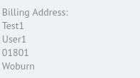
This widget is only configured through layout and its subelements and needs only a simple widget registration. The following example shows how the attributes first_name, last_name, postal_code, and city can be arranged in a layout using the default width, which results in a line break after each attribute.
1 { 2 "layout" : [ 3 { 4 "id" : "address" , 5 "layout" : [ 6 { 7 "layout" : [ 8 { 9 "attribute" : "first_name" 10 } , 11 { 12 "attribute" : "last_name" 13 } 14 ] 15 } , 16 { 17 "layout" : [ 18 { 19 "attribute" : "postal_code" 20 } , 21 { 22 "attribute" : "city" 23 } 24 ] 25 } 26 ] 27 } 28 ] , 29 "widgets" : { 30 "address" : { 31 "type" : "attribute_layout" 32 } 33 } 34 } This example result in the following view of the billing address at an order, in which the grid distributes the cells automatically.
Attribute_listing Widget
The attribute_listing widget can show system and custom attributes in either one, two or three columns in the order of the configuration.
Name Type Description columnsinteger the number of columns (1, 2, or 3) to use attributesarray of strings the attributes to display show_emptyBoolean whether an attribute appears when no value’s defined default is false
1 { 2 "columns" : 2 , 3 "attributes" : [ "attribute1" , "attribute2" ] 4 } Link Widget
A link widget shows a link with an href and text information.
1 "product_link" : { 2 "link" : { 3 "type" : "link" , 4 "data" : { 5 "href" : { 6 "template" : "/s/{0}/dw/shop/v16_9/products/{1}" , 7 "attributes" : [ "SITE_ID" , "id" ] 8 } , 9 "text" : { 10 "template" : { "default" : "Product {0}" } , 11 "attributes" : [ "id" ] 12 } 13 } 14 } 15 } Tabs Widget
Use the tabs widget to place tabs somewhere in the layout. Each tab can be of type widget_tab or form_tab.
Tabs can contain available widgets and forms.
Name Type Description type
string
Declares the type of tab:
caption
a template to define localized meta data
1 "caption" : { 2 "template" : { 3 "de" : "Kunde (de)" , 4 "default" : "Customer Data" , 5 "de-DE" : "Kundendaten (de-DE)" 6 } 7 } config
A configuration for form_tab tabs:
area_id (string): Specifies the area id to appear in this tab.
default_data_provider (string): A data provider to access the data in the form
query_params (Boolean): query params for the particular data provider
1 "tabs" : { 2 "type" : "tabs" , 3 "config" : { 4 "tabs" : [ 5 { 6 "type" : "widget_tab" , 7 "caption" : { 8 "template" : { 9 "default" : "Coupons" 10 } 11 } , 12 "widget_id" : "basket_coupons" 13 } , 14 { 15 "type" : "form_tab" , 16 "caption" : { 17 "template" : { 18 "default" : "Customer Data" 19 } 20 } , 21 "config" : { 22 "area_id" : "customer_view" , 23 "default_data_provider" : "Customer" , 24 "query_params" : { 25 "customer_id" : { 26 "attribute" : "customer_info.customer_id" 27 } 28 } 29 } 30 } 31 ] 32 } 33 } The main layout section needs a reference to the tabs widget only to show the configured tabs with their content.
1 "layout" : [ 2 { 3 "layout" : [ 4 { 5 "id" : "tabs" , 6 "width" : 8 7 } 8 ] 9 } 10 ] Text Widget
The text widget shows localized and parametrized text.
1 "text_id" : { 2 "type" : "text" , 3 "data" : { 4 "template" : { 5 "default" : "Hello World - {0} - {1}:" 6 } , 7 "attributes" : [ 8 "order_no" , 9 "site_id" 10 ] 11 } 12 }



 j
j