Branding and Theming

The Agentforce iOS SDK provides comprehensive theming capabilities for customizing the visual appearance of chat interfaces and UI components.

Theme System 

The Agentforce iOS SDK includes a sophisticated theming system built on top of Salesforce’s design system. The theming system provides:

  • Color Theming: Complete color palette customization with semantic tokens
  • Light/Dark Mode Support: Automatic switching and explicit mode setting
  • System Integration: Adapts to iOS appearance preferences
  • Reactive Updates: Observable state management for real-time theme changes

Key Components 

  • AgentforceThemeManager: Central theme management interface
  • AgentforceDefaultThemeManager: Default implementation with Agentforce Cosmos design tokens
  • AgentforceThemeMode: Configuration for theme modes (light, dark, system)
  • AgentforceColors: Protocol for color palettes with semantic color tokens

Color Tokens 

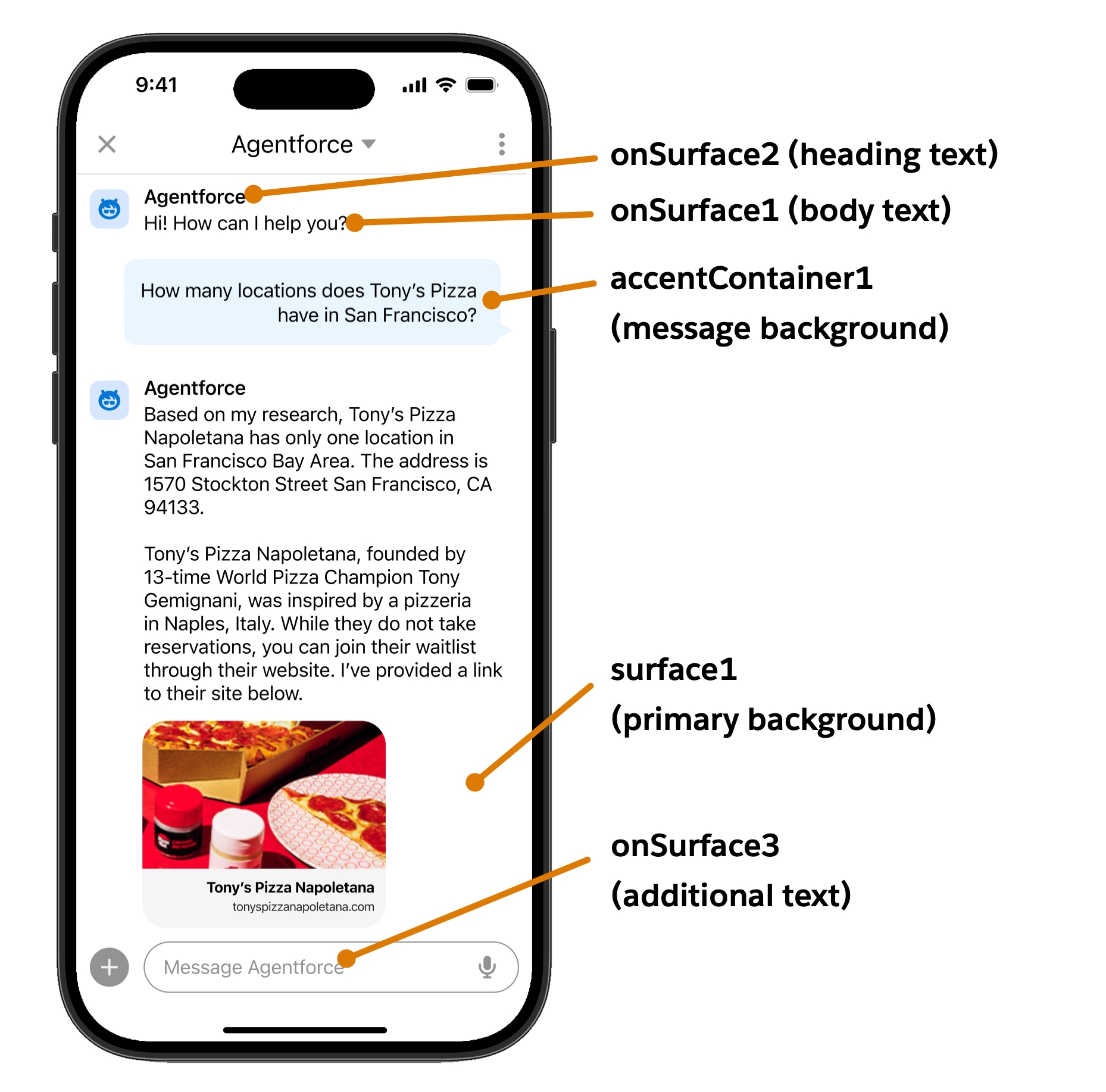
The theming system provides comprehensive color tokens organized by purpose.

Agentforce Mobile SDK Branding

Surface Colors 

  • surface1: Primary view background
  • surface2: Secondary view background
  • surfaceContainer1: Default container background (cards, modals)
  • surfaceContainer2: Darker container background
  • surfaceContainer3: Darkest container background

Text and Icon Colors 

  • onSurface1: Lightest text/icon fill (body text, labels)
  • onSurface2: Darker text/icon fill (headings, input fields)
  • onSurface3: Additional text/icon variant

Accent Colors 

  • accent1: Button icons and interactive elements
  • accent2: Links, hover states, primary actions
  • accent3: Selected states
  • accentContainer1: Branded button backgrounds
  • onAccent1: Text/icons on accent containers

Feedback Colors 

  • error1: Error text and icons
  • errorContainer1: Error alert backgrounds
  • onError1: Text on error containers
  • borderError1: Error button borders
  • successContainer1: Success alert backgrounds
  • onSuccess1: Success text and icons
  • borderSuccess1: Success button borders

State Colors 

  • disabledContainer1: Disabled white component backgrounds
  • disabledContainer2: Disabled dark component backgrounds
  • onDisabled1: Text on light disabled containers
  • onDisabled2: Text on dark disabled containers

Brand Colors 

  • brandBase50: Primary brand color
  • errorBase50: Error brand color
  • feedbackWarning1: Warning text color
  • feedbackWarningContainer1: Warning container background
  • info1: Information text color
  • infoContainer1: Information container background

Implementation 

The following sections show how to implement theming in your iOS application.

Basic Theme Setup 

1import AgentforceSDK
2
3// Create default theme manager
4let themeManager = AgentforceDefaultThemeManager(themeMode: .system)
5
6// Use in configuration
7let configuration = AgentforceConfiguration(
8    agentId: "YOUR_AGENT_ID",
9    orgId: "YOUR_ORG_ID",
10    forceConfigEndpoint: "YOUR_INSTANCE_URL",
11    theme: themeManager
12)

Custom Theme Implementation 

1@Observable
2class CustomThemeManager: AgentforceThemeManager {
3    var colorScheme: ColorScheme = .light
4    var overrideColorSchemeWithSystem: Bool {
5        return true // Allow system theme switching
6    }
7
8    var colors: AgentforceTheme.Colors {
9        colorScheme == .light ? CustomLightColors() : CustomDarkColors()
10    }
11
12    // Protocol requirements (not used by UI components)
13    var fonts: AgentforceTheme.Fonts {
14        SalesforceCosmosFonts()
15    }
16    var dimensions: AgentforceTheme.Dimensions {
17        SalesforceCosmosDimensions()
18    }
19    var shapes: AgentforceTheme.Shapes {
20        SalesforceCosmosShapes()
21    }
22}
23
24// Custom light colors using inheritance approach
25class CustomLightColors: AgentforceCosmosLightColors {
26    override var accent2: Color {
27        Color(hex: "#E74C3C") // Your brand red
28    }
29    override var accentContainer1: Color {
30        Color(hex: "#FDEDEC") // Light red container
31    }
32    override var surface1: Color {
33        Color(hex: "#FEFEFE") // Slightly warm white
34    }
35    // All other colors inherit from AgentforceCosmosLightColors
36}
37
38// Custom dark colors using inheritance approach
39class CustomDarkColors: AgentforceCosmosDarkColors {
40    override var accent2: Color {
41        Color(hex: "#FF6B6B") // Brighter red for dark mode
42    }
43    override var accentContainer1: Color {
44        Color(hex: "#4A1412") // Dark red container
45    }
46    override var surface1: Color {
47        Color(hex: "#1C1C1E") // iOS-style dark
48    }
49    // All other colors inherit from AgentforceCosmosDarkColors
50}

Theme Mode Switching 

1// Runtime theme switching
2customThemeManager.colorScheme = .dark
3
4// System theme detection
5let systemThemeManager = AgentforceDefaultThemeManager(themeMode: .system)

Limitations 

Currently, only color theming is supported. Fonts, dimensions, and shapes are not yet implemented in the theming system.

Best Practices 

The following best practices ensure effective theming implementation.

  1. Use Semantic Colors: Always use semantic color tokens rather than hardcoded colors
  2. Test Both Modes: Ensure your custom colors work well in both light and dark modes
  3. System Integration: Use .system mode to respect user preferences
  4. Inheritance: Extend base color classes rather than implementing from scratch
  5. Accessibility: Ensure sufficient color contrast for accessibility compliance

Next Steps